A plataforma MATCH POINT pretende ser uma comunidade onde os nossos descobridores irão sugerir produtos portugueses aos quais não conseguem aceder e a TWENTYFIRSTTEAM vai encontrar mercadores que disponibilizem esses produtos para além de fazer a sua publicidade e divulgação.
Está interessado? Venha fazer parte da nossa comunidade!!!

Mostrar mensagens com a etiqueta PRODUTOS. Mostrar todas as mensagens
Mostrar mensagens com a etiqueta PRODUTOS. Mostrar todas as mensagens
sexta-feira, 1 de junho de 2012

quarta-feira, 23 de maio de 2012
PORTUGAL DOES IT BETTER #07
Wine - About Packaging & Design

Wine label for Quinta da Bichinha, a wine producer from Lisbon region, and this is Prima Casta Red wine for China Market. It is an elegant and distinct label and that's why we decided to use the black color and the foiled gold. The text below the brand's name is printed with a soft gray, overprinted with high screen built to reinforce the elegance of he label.
Another wine label for a Portuguese wine producer from the Lisbon region, inspired by Barcelo's cock (a traditional legend). This label was developed for Quinta da Bichinha, for the chinese market and is printed using black, foiled gold and high screen built on the brand's name.
100 Hectares is a Douro valley wine producer, from Portugal, and this label all in black an heavy gray, uses a soft paper and high screen built on the brand's name and squares above.
The brand and the squares above are inspired in the property's dimension, measured in Hectares and there are 100 squares on the top of the label. This is the 3rd label release, after the white and red wine.


Wine - About Packaging&Design

´
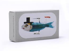
This is a range of wines that the Belgian supermarket chain Delhaize offers within its own "365" brand, which includes basic, everyday products at an affordable price.
We set as a starting point, communication in the spirit of the "365" brand: simplicity and ‘why not?’ humor, irony, ensuring that the whole range had a visual unity. In addition, we had to ensure that the entire line had a visual unity. This was also a requirement of the brief.
It seemed interesting to us to communicate the simplicity of the product, since there were also other ranges of own-brand wines at a higher price. And we sought a motif or an element capable of communicating effectively. And so we hit upon the cap.
The wine cork is a sign of humility, an object of little value, often used for handicrafts, as simple, base and easily manipulated raw material with which to play, create and to serve the most unexpected uses. The use of cork as the main motif for the label gives the air of being crafted and of fun. All from something simple, typical of an everyday product. The cork is also the element which unifies and personalizes the entire line.
The design of each label refers to the country of origin. In the case of France the different types of wine are identified by a style of French hat: the boater, Napoleon's hat, haute cuisine chef's hat or the kepi of a French gendarme …
And so with the same language, other sources are resolved: the Native American and the cowboy for the California wines, the elephant for the South African, a footballer for Argentine wine or the Easter Island moai for that of Chile.
The humility of a product and its low cost need not be at odds with humor, with the intent and with an intelligent public.
* DELHAIZE is a Belgium distribution chain with more than 800 supermarkets in nationally and over 1500 on the east coast of the USA.


Source : Packaging of the World | Design :: Lavernia & Cienfuegos
terça-feira, 22 de maio de 2012


quarta-feira, 16 de maio de 2012

domingo, 13 de maio de 2012
Água de Prata
A fonte da água de prata nasce junto à Igreja de Nossa Senhora da Graça do Divor entre Arraiolos e Évora.
Fonte de inspiração para a marca criada em 2006 por João Bruno Videira, artesão e designer autodidacta, formado em ciências da comunicação.
A água de prata explora um novo conceito de mobiliário que alia técnicas e materiais tradicionais ao design.
A lã de Arraiolos é o fio condutor da água de prata, que reinventa o uso desta matéria-prima de excelência e dá corpo a criações de autor expressas em intensas composições cromáticas.
A introdução do restauro e da reciclagem de mobiliário velho e obsoleto na filosofia da marca, permite a concepção de soluções personalizadas, irrepetíveis.
Movida pela investigação e constante reinvenção de objectos, a água de prata revela uma nova abordagem da arte portuguesa resultante de um encontro singular entre artesanato e design.
in aguadeprata.blogspot.com

terça-feira, 8 de maio de 2012

segunda-feira, 7 de maio de 2012

sábado, 5 de maio de 2012
quinta-feira, 3 de maio de 2012


Subscrever:
Mensagens (Atom)